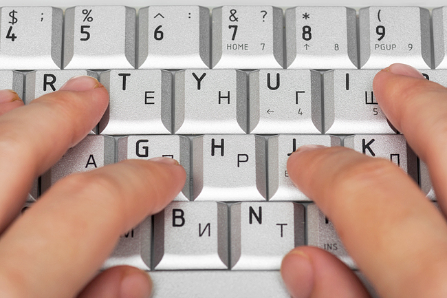
THE WASHINGTON POST – You make font choices every day. You pick type designs each time you use a word processor, read an e-book, send an e-mail, prepare a presentation, craft a wedding invite and make an Instagram story.
It might seem like just a question of style, but research reveals fonts can dramatically shape what you communicate and how you read.
Fonts are “the clothes that words wear”, said early 20th-Century editor Beatrice Warde. They also embody style, emotion and authority. Like a villain’s costume in a movie, they quietly tell part of the story.
“The signals that we can send are often quite small, like the symmetry of round shapes in the letter B,” said designer Tobias Frere-Jones, whose work includes the font used by the 2008 Obama campaign. “But they get their power by being repeated over and over again.”
Like clothes, fonts are also functional choices. Just as you wouldn’t wear a bathing suit in a snowstorm, fonts have to fit the technology delivering the words (screen or paper), the space they inhabit (phone alert, page or billboard) and the person doing the reading.
Picking the right font can increase your reading speed on a screen by 35 per cent, according to a large recent study.
Fonts have subtle elements that impact how you perceive them. In that sense, fonts are like eyeglasses.
“They’re the lens through which you perceive written text,” said research scientist Zoya Bylinskii at tech company Adobe.
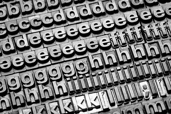
Most commonly used fonts can be broken into two types: serifs and san-serifs.
Serif fonts, like Times New Roman and Garamond, have decorative “wings” and “feet” on letters – called serifs – that make the form more distinctive. These have traditionally been used for longer text passages like books.
Sans serif fonts, like Arial and Helvetica, are defined by what they don’t have: those “wings” and “feet”. They have cleaner lines and are considered best for titles and shorter text.
Other types include display and cursive-like script fonts.
But even within these groups, there’s a world of variation that impacts how we perceive words. The most important characteristics bundled into a font include:
– Proportion: Letters become harder to parse when they start to resemble each other too much, such as when they’re very condensed.
– Contrast: the difference between the thinnest and thickest part of each letter. If the contrast is too high, parts of the letters might fade away and become a strain on your eyes.
– Letter spacing, also known as ‘tracking’: Crowd more letters into a space and your ability to read it suffers.
A bad font choice can confuse you about which letters are which. It can also interfere with your ability to quickly recognise the familiar overall shape of a word.
Each font has a different X height – literally the height of a lowercase letter x compared to a capital one – that can make words easier or harder to read.
When it comes to glancing at small text, like on a phone alert, X height is a big factor in font readability. Researchers studying drug labels have found that X height was much more important than overall type size in how readable a label was.
The device you’re reading on can also make a huge difference: The latest high-resolution screens (particularly on phones) make it possible to use fonts with more contrast at smaller sizes. (At the same time, some fonts that were developed for older, low-resolution screens look a bit gross on our modern ones).
So what about when you’re reading whole paragraphs of text, like on The Washington Post’s website?
Last year, researchers at Adobe published a large study of how people experience fonts for this sort of reading. They asked participants to read several short passages of text in different fonts and timed the volunteers to see which font they read the quickest. These were all pretty normal fonts – nothing extra zany that would make for an obvious hurdle.
The researchers found font choice could make a huge difference in speed. This was the study where, on average, participants read 35 per cent faster in their fastest font than in their slowest one.
Which font works best for you? In the study, the font people read fastest, on average, was Garamond – a serif font.
But that doesn’t mean we should all be reading in Garamond. In fact, the study found individual differences were more significant than the speed improvements from using any one font.
The font that best served the widest audience was the sans-serif Franklin Gothic – it was the fastest font for 59 per cent of the participants.
Then what does science tell us about the best font? “It’s actually rather sad, but the answer is there’s no one font that works for everyone,” said principal Jakob Nielsen of the Nielsen Norman Group consultancy and a leading experts on usability. “There are individual differences and it may even simply be a matter of experience and exposure as well.”
The best font for you can depend on when and where you grew up and what you’re most accustomed to reading. “Type designs are just everywhere,” said Jessica Hische, who wrote the font-themed children’s book Who Will U Be? and has designed many well-known logos.
“We absorb this culture in the background as we live our lives.”
Age is likely the top factor, both because your vision weakens over time and because different generations grow up reading different fonts. Some fonts can, in a sense, be ageist: In the 2022 reading speed study, people older than age 35 read all of the fonts more slowly except for Garamond and Montserrat. The latter also happened to have the largest X height in the test.
That brings us back to the comparison between fonts and glasses. We all need different font prescriptions.
“If you and I swap eyeglasses, we would not see the world as well. And it turns out that if you and I want to approach a page of text, we will have different reading experiences if the font is tailored to our perceptions,” said entrepreneur-in-residence Rick Treitman at Adobe involved in the study.
So how do you pick the right font for you? When in doubt, experts say, simpler is better – put function over form.
And when you have time, experiment. “Read in the worst light of evening – what is the font that makes you feel like you don’t immediately have to go to sleep,” said Hische. The organisation Readability Matters offers a website where you can try on many different aspects of fonts to find what works best for you. – Emma Kumer, Geoffrey A Fowler & Leslie Shapiro


