Kelsey Ables
THE WASHINGTON POST – It’s used in the Impressionists’ sumptuous seas and skies, favoured by a depressed Picasso and a spendthrift Vermeer. Once more valuable than gold, ultramarine blue, now sold in its synthetic form, is so popular today it ranks just below whites and blacks in sales by top suppliers of paint for artists.
But if you’re a painter keen on “true blue”, you might want to rethink your next masterpiece. In our volatile, supply-chain-challenged world, sourcing ultramarine, along with a host of other blue pigments, has been difficult to impossible. The colour could be creating blue skies on canvases today, and – like cream cheese – be in short supply tomorrow.
Jumping straight into your “Rose Period” might not help, either.
A shortage of titanium dioxide, the pigment for titanium white and a fundamental ingredient in about a third of artist paints, also puts other colours at risk. And beyond paint, conservators are missing swabs and tissues to clean paintings. Artists have struggled with shipping delays on essential equipment like canvas and stretcher bars. But shortages of colour are more disconcerting – particularly when it comes to blue, the world’s calm and cool favourite colour, according to numerous surveys.
Earlier last year, paint companies feared they might run out of synthetic ultramarine when one of two main factories in France that supply the pigment for the colour stopped making it, and the other, unable to keep up with the resulting demand, restricted international exports.
And that’s not the only blue that has been scarce. AkzoNobel, a house-paint manufacturer based in the Netherlands, has reported difficulties sourcing the 50 to 60 ingredients needed to make a shade of blue used in its industrial coatings. Golden Artist Colours, a paint company in New York, noted the dearth of titanium white could limit the production of mixed blue paints, such as light phthalo blue and light ultramarine.


The idea that blue paint could vanish entirely may seem absurd, but even the suggestion – made in headlines last fall – is enough to foment existential doom. It was once easy to forget that the colours we experience in art and in our daily lives are materials – designed, selected and transported physical goods. Today, the supply-chain crisis has snagged the stitches of our reality and revealed the seams.
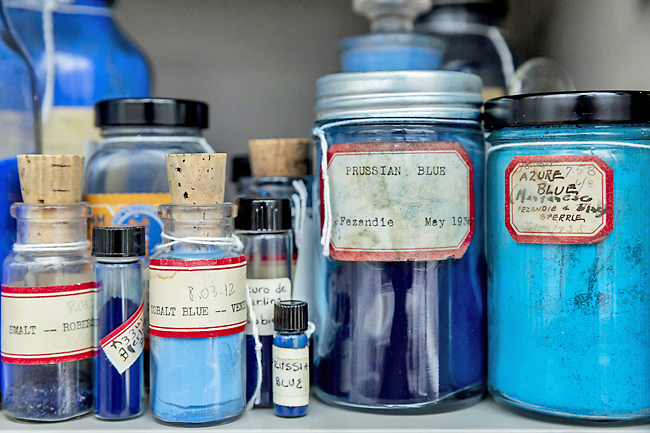
“Something that people don’t think about is that everything is colored,” said Narayan Khandekar, curator of the Forbes Pigment Collection at Harvard Art Museums, which has more than 2,700 pigments. “A white wall is not just a white wall, it’s either a warm or cool white.
Even car tires – each car tire has probably six pounds of carbon black in it to make it black instead of latex milky white. There are pigments used everywhere, even in ways that we take for granted.”
Asked what they’d do without titanium white, Pete Cole, president of the paint manufacturer Gamblin Artists Colours in Portland, Oregon, said, “Our Earth would cease to rotate.”
Looking back on the past year, United States (US) paint companies describe chaos. John Polillo, operations vice president at Blick Art Materials, said it’s like nothing he has seen in four decades in the industry. He hoped the situation will improve by the spring, after celebration of the Lunar New Year in China. The holiday should slow production there and help alleviate shipping bottlenecks elsewhere, he said.
The strain on materials began with base ingredients. During February’s record-breaking freeze in Texas, major petrochemical plants shut down, leading to a shortage of resin, a plastic additive used in paint. Then, paint companies faced a shortage of flaxseed oil, which some have blamed on pandemic-induced health fads.
Eventually, colours started coming and going, seemingly at random. Golden Artist Colours said its popular, earthy quinacridone golds and browns have been discontinued. During a COVID-19 surge in India, the company couldn’t obtain quinacridone magenta and hansa yellow because the government had to reroute to hospitals all industrial oxygen normally used to produce those colours.
Artist paints are unique in that they feature highly concentrated pigments, made of elements and other ingredients sourced directly from the earth.
“If I if I sell you a tube of ‘burnt sienna’, that is honest burnt sienna, dug up out of the ground, burned in an oven,” Cole said. And that means there are no substitutions. One gramme of natural Tyrian purple pigment, for instance, takes 120 pounds of sea snails to create, so paint companies make a mixed, artificial hue instead.
It is this combination of hyper-specific pigments and a global trade network that makes artist paints uniquely vulnerable to supply-chain issues. “You have a constant flow of colour moving around the world,” Cole said. “You have mined pigments from Italy. You have cadmiums being made in places that are all hard to get to, like India and Brazil. You have modern pigments being made in Germany.”
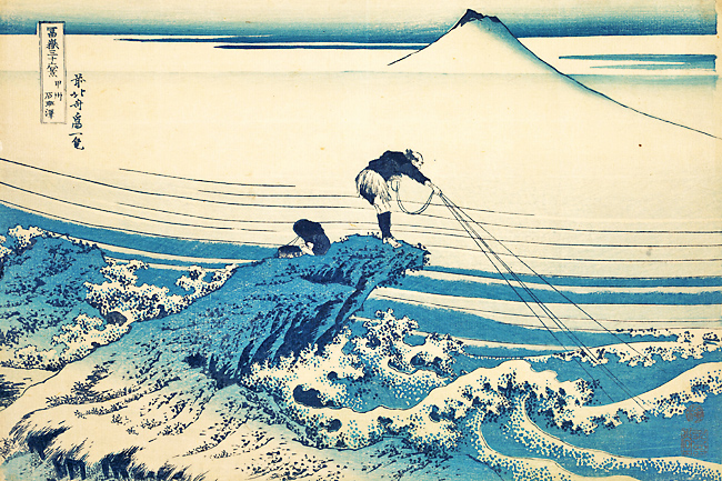
A glancing look at some key works in art history reveals how paints and pigments function like a technology of vision. Monet’s rich yellow sunsets and landscapes could only be painted after the invention of cadmium yellow in the early 19th Century. Hokusai’s The Great Wave, and the rest of his Thirty-Six Views of Mount Fuji series, wouldn’t have been possible without the then-recent arrival of Prussian blue ink in Japan. Losing access to a pigment is like losing a means of seeing.
Many famous artists have used blue in excess. A 20-something Picasso, beset by depression after a friend’s death, famously created more than 100 paintings during his Blue Period. The spiritually inclined abstract painter Yves Klein trademarked his own vivid International Klein Blue and used it almost exclusively, believing it was the best colour to use to paint “the void”.
Johannes Vermeer practically went broke for blue. Seeking a durable blue paint 300 years earlier, Vermeer would have been limited to natural ultramarine blue. (The cheaper, synthetic version wouldn’t be invented until 1826). Made from lapis lazuli – a semiprecious stone sourced from a remote river valley in Afghanistan – ultramarine was outrageously expensive, so most artists reserved the colour for special occasions, such as painting the ceiling of the Scrovegni and Sistine chapels.
But not Vermeer. The Dutch artist applied ultramarine to mundane scenes of ordinary people with the skill of a master and the self-restraint of a child. Ultramarine blue floods the shawl of Vermeer’s Girl With the Red Hat. It glistens above the soft face of the Girl With a Pearl Earring. In Woman Holding a Balance, the mountainous, ultramarine fabric on the table suggests a great expanse, as if the woman looks down into some mysterious elsewhere.
Coupled with his low productivity and poor business acumen, Vermeer’s love of ultramarine ultimately drove him and his family into debt.
After working on the 2016 exhibition “Infinite Blue”, Joan Cummins, curator of Asian art at the Brooklyn Museum, understands the role of international trade in creating works of art.
She noted that ultramarine blue appeared in Egyptian art thousands of years ago, despite having to be imported from Afghanistan. And she hypothesises that Titian, millennia later, might have been able to use so much ultramarine blue because his location in Venice put him in proximity to the first load that came off the ship.
Cole reasoned that ultramarine blue’s popularity today might have to do with its functionality.
“If you’re trying to paint the colours of the natural world, there are colours you struggle with and there are colours that practically do it for you – ultramarine blue is one of those colours,” he said. “It does its job so incredibly well.”
Another clue to blue’s popularity might be found in that long-sought-after “true blue”. Named for the long trip it took from Asia to reach the palettes of European painters, “ultramarine” derives from the Latin “beyond the sea”. At a time of pandemic-related physical restrictions, when good health is fickle and travel is fraught, we might find ourselves especially aching for blue.
“We associate (blue) with things that are big and limitless,” Cummins said. “I think a lot of people find it transporting.”


