


Jura Koncius
THE WASHINGTON POST – Part of Florida designer Lisa Gilmore’s job is suggesting paint colours that can deliver a big wow factor.
Dramatic colours are a way to make your home feel special and to “create a presence of who you are and what your personality is,” said Jamie Drake of Drake/Anderson in New York. Drake recently finished a book with the firm’s co-founder, Caleb Anderson, titled Bold: The Interiors of Drake/Anderson.
We asked Gilmore and Drake, as well as Los Angeles designer Kathryn M Ireland and Silver Spring, Maryland designer Iantha Carley, to share their favourite shades of blue, yellow, green, pink and purple. Here are their suggestions.
Purple
Softened Violet by Benjamin Moore. Using a deep-violet paint takes guts, but Gilmore said this spirited colour can create a dramatic Zoom backdrop that will make meetings memorable. “This is such an appealing colour, because this is kind of an underdog of purples and rarely used in such a large format. But it radiates a bit of happiness,” Gilmore said. She used Softened Violet, along with red and cobalt blue, in the St Petersburg, Florida, condo of art collectors who love modern design. The room is a combination guest room and Zoom room/home office.
Charleston Grey by Farrow & Ball. Don’t be deceived by the name of this paint colour, Carley said. It’s really more of a lavender than a grey. This “taupey grey-purple” is one of her go-to shades. She used it in her own bedroom as well as the bedroom of a client in Bethesda, Maryland. “It’s great for bedrooms of any size. It just always works. And I find it soothing,” she said. And men, including her husband, tend to love the colour. “He likes it because it’s a bold colour without being dark,” she said.
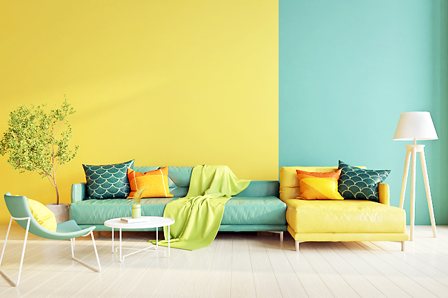
Yellow
Delightful Yellow by Benjamin Moore. “This yellow is such a joyous colour and reminds me of the sunflowers in the south of France and Monet’s kitchen at Giverny,” Ireland said. It brings a sunny glow to any space. She has used it for splashes of colour in hallways, on floorboards and on kitchen cabinetry. “It gives an uplifting moment without being too much,” she said.
Yellow Tone by Benjamin Moore. Drake said the multifaceted Yellow Tone is not a typical yellow. “It appears especially delicious, because it has that dollop of green and reminds you of a gemstone: the citrine,” he said. His firm’s co-founder, Anderson, chose that colour for his own New York home’s second bedroom, which doubles as an office. “The citrine and chartreuse in it highlight the strong architectural elements in the room,” Drake said.
Green
Wasabi by Benjamin Moore. Carley loves the sassy yellow-green of Wasabi. She used it in a small Maryland condo kitchen that has little light to give the place some punch when the client’s budget didn’t allow for new cabinets. “Just painting the walls Wasabi will make any room special,” Carley said. “It has just enough yellow in it, which makes it perfect for rooms that don’t receive a lot of any natural sunlight. It’s great for a kitchen, dining room, entry or powder room.”
Derbyshire by Sherwin-Williams. There’s no question that Derbyshire is a bold, lively green, Gilmore said. If someone is leery of committing to it for a full wall, she suggests using it on a vanity or a piece of furniture to add interest. But it’s also a stunner when used in the entire room. “I can see this used in a home office or a formal living room, using built-ins and carpentry details,” Gilmore says, “creating a very bold and sophisticated look”. Her pro tip: “Do this shade in a glossy finish to really pump up the volume and luxe feel.”
Blue
Old Navy by Benjamin Moore. Drake said navy can work in any room and a dark navy, such as this one, can actually make a room feel more spacious. He likes this particular shade because it has a bit of warmth to it. He used it in a small library that doubles as a guest room in New York’s West Village, painting the space in a semi-gloss finish, “so it has a bit of reflectivity to it,” Drake said. “Some people think you should avoid colour in a small room, but we disagree, and we think you should go the boldest there.”
Caribbean Teal by Benjamin Moore. Ireland chose this bluish-green tone for a cozy room in California that is used as both a library and a place to have dinner. “Everything in the room, from ceilings to bookshelves, is painted the same colour,” Ireland said. The shade is sophisticated and lends itself well to a small space. Painting the shelves and woodwork one colour gives a room a look that can be either 18th-Century classic or 21st-Century modern, she said. “It’s particularly good for nighttime with low lights to create a moody space,” Ireland added.
Pink
Juneberry by Sherwin-Williams. “Juneberry is a colour that claims the room,” Gilmore said, “so if you are looking for a paint colour that pops and adds a level of luxury and romance, then this is it.” If you do commit to a colour with serious drama, Gilmore said, consider also bringing it into the furniture and window treatments for a cohesive look. And reference your bold colour in other rooms. “Do a continuous thread throughout your other spaces, so it all makes sense,” Gilmore said. That can be achieved with a pillow or a lamp, or with the same colour in a piece of art.
Salmon Peach by Benjamin Moore. How do you use pink on the walls and not make it look too pretty? Drake likes Salmon Peach, because it has some depth. “It’s not really a feminine pink,” he said. According to Drake, bringing in black and charcoal gray furnishings to the pink space made it “a little earthier and grittier.”