


AP – Dark hues have a bad rap as gloomy and depressing. More likely, they’re bringing home the good vibes, all year long.
One weekend when I had the house to myself, I painted our family room Benjamin Moore’s Kendall Charcoal, a deep, earthy grey.
I waited till I had two days alone to do it because it looked pretty shocking when I got started on the trim and rolled the walls.
Was it going to veer into Goth Teen Bedroom territory? Or maybe a villainous, albeit stylish, lair?
But when I’d finished, it looked amazing. The rich colour, along with white trim and comfy furnishings, gave the room way more character, and felt much homier than the basic beige had.
When the weekenders returned, the response was as I’d hoped; everyone loved it.
That was in 2018, and it’s the only room I haven’t repainted twice since, so there you go.
Turns out I’m not a loony outlier when it comes to loving dark paint.
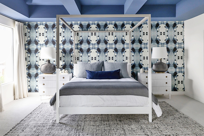
For Apartment Therapy’s 2024 State of Home Design report, editors tallied 131 design experts who said “moodiness” will be one of the year’s hot vibes.
Pros said darker hues are more likely to create resonant atmospheres like coziness, stylish ambiance and even a little drama to keep things interesting.
Rooms with these colours aren’t boring, nor are they over-stimulating. They envelop and embrace.
“Moody hues are more than just visual,” said designer Noz Nozawa. “They’re storytellers, deeply evocative, emotional and often very nostalgic.
GOING WITH EVERYTHING
She thinks people don’t give dark hues enough credit for their versatility, and points out how well they go with different woods, metals and brighter hues.
“I often like to use them as a grounding point – they anchor a room, and then all the other textures and elements in a space can harmonize around them,” she said.
Try it yourself, Nozawa said, by holding a moody colour swatch next to different woods and metals.
“The swatch will complement in a way that’s warm and comforting, not gloomy or heavy,” she said.
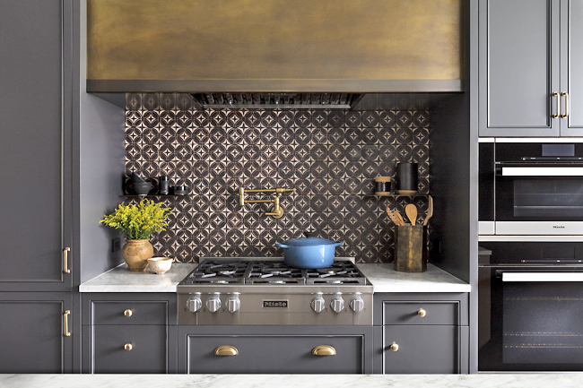
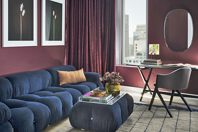
Tasked with choosing BlueStar’s 2023 Color of the Year for their appliance collection, she went with a deep, fruity deep Red, which pairs well with different finishes and might remind you of a cozy evening sharing a glass with friends.
LIFTING THE MOOD
“Here in the Pacific Northwest, about two thirds of our days are moody,” said Peter Spalding of the interior furnishings marketplace Daniel House Club in Portland, Oregon.
“To cope, we drink a lot of coffee and buy tactical gear instead of fancy dress,” he laughed.
“You’d think brightly coloured interiors would be sure-fire medicine too, but actually some of the coziest interiors I’ve done here have been in moody greens, blues and greys.”
He’s not a fan of cool greys, especially in the Northwest’s dreary light.
“But a warm French grey is another thing entirely. It’s sort of creamy, with green undertones, and creates a cocoon that no one wants to leave,” Spalding said.
That chameleon quality, where a colour shifts slightly depending on the light, is what you’re after, he said. Besides dove grey, Spalding favours deep russet and dark forest hues.
“They can glow in the sun, or create a cozy envelope when it’s gray outside.”
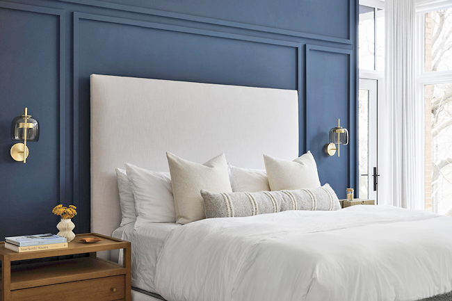
Jennifer Verruto of Blythe Interiors in San Diego likes how these hues make a space feel settled and warm.
“Forget the idea that dark colors turn rooms into caves of doom. It’s time to embrace the moody vibes! They have an energy. A room wrapped in a dark, dramatic colour can actually provide an uplifting, invigorating feeling,” she said.
BALANCING LIGHT AND DARK
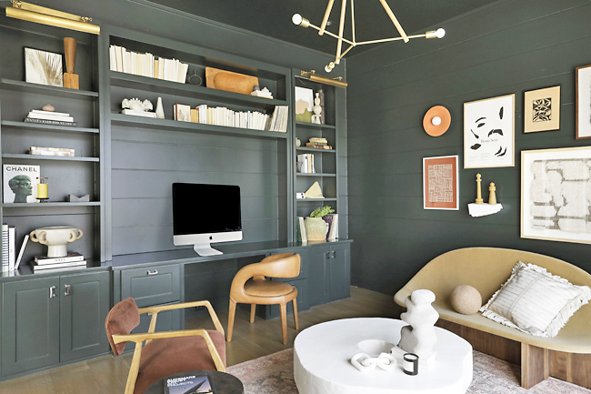
She advised counterbalancing any potential heaviness. Position mirrors to bounce light around. Bring in lighter furniture, rugs and décor. Use warm woods and nature-inspired motifs for a comforting, organic vibe. Some of her favourite paints: Sherwin-Williams’ Iron Ore, Gale Force and Pewter Green.
Deep blue could remind you of an oceanside vacation.
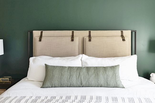
Mossy greens might evoke a favourite woodland hike. Mineral hues like citrine, garnet, iron and copper also have that earthy connection.
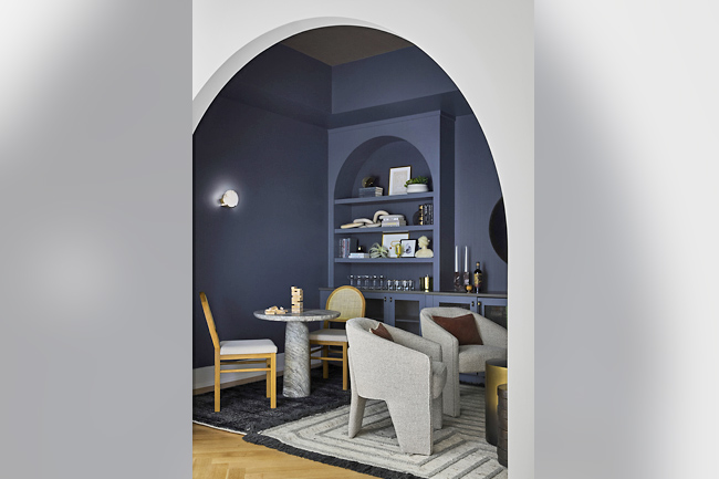
Brad Ramsey, who has his own interior design firm in Nashville, loves to create a “jewel box” space.
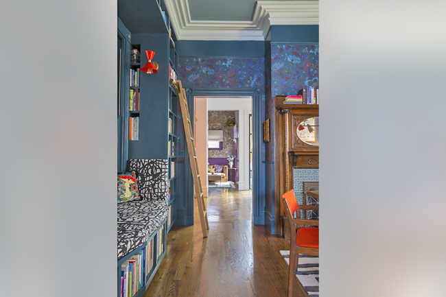
“By taking a moody hue and colour-drenching the walls, drapery, even the ceiling, you get this cocoon-like feel,” he said.
A study, dining room or den in a larger home can, when made darker, work well as an intimate social space, or a retreat for some quiet “me” time, he said.
CREATIVE PAINT NAMES
Some of the imaginative names for these paint colours are as much fun as the hues themselves.
Dock Blue, Basalt, Goblin, Adventurer and Jewel Beetle are all to be found at British paint maker Little Greene, which has branched into the North American market now.
Backdrop’s founder Natalie Ebel said she wants to evoke a place or a feeling with the paint names. Masterpiece Theater is their first brown, with olive and a little yellow in it.
“It’s a colour that really lends an atmosphere to a space, like a period drama for your walls,” she said. Backdrop has even developed an accompanying playlist, which includes some Verdi, Rossini, Bizet and Hans Zimmer.
Their warm-purple red called Lobby Scene was inspired by Wes Anderson’s movie The Grand Budapest Hotel. And a deep olive green is among the company’s most popular paints. Its name: Night on Earth. – Kim Cook

