ANN/THE STAR – Creating a home is about building a sanctuary – a place where we can unwind, recharge, and connect with both loved ones and nature.
With a modern Zen approach, it’s possible to transform a house into a space that radiates harmony and balance. Shadee Hizami Khalid and his wife, Norliyana Nasir, have brought this vision to life in their new home.
After a decade of moving frequently – relocating about 11 times in 10 years due to Norliyana’s job as a lecturer and their business – it was time to settle down and put down roots.
Together, they now run a design and build company called Rekabrick. While searching for the perfect property, they came across a quiet neighbourhood close to their office. “We saw this empty house, and as luck would have it, the owner was willing to sell,” Shadee explained.
Although it was a sub-sale property, the four-bedroom house was practically new, having never been occupied or leased, giving Shadee the perfect blank canvas to create their ideal space.
“I grew up loving Japanese manga and we’ve travelled to Japan a few times as a family.
The calming vibe and relaxing ambience of Japanese houses certainly left an impression on me,” said Shadee, who wanted the family home to feel zen, and turned to Aida Amira Azlen, architectural designer at Rekabrick to help execute the couple’s vision.
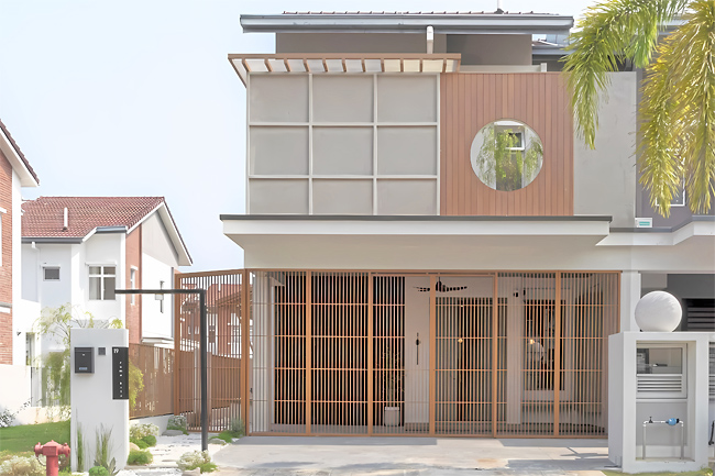
The result? A 1,700 square feet double-storey Shah Alam house that perfectly showcases their deep appreciation for Japanese design, along with modern-day functionality and maximum comfort.
TRANQUIL VIBES
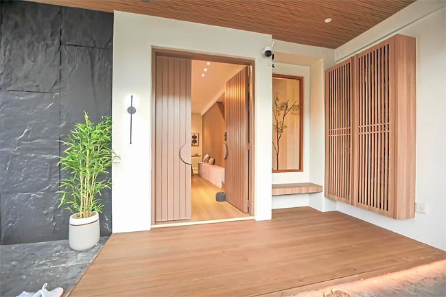
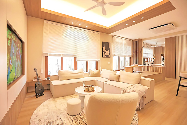
The aptly named Ruma Kita house is imbued with a sense of tranquillity and harmony as you step through the front door with its emphasis on open spaces, minimalism and balance. The airy, open living area welcomes guests while a platform separates this area from the dining area without the need for a wall.
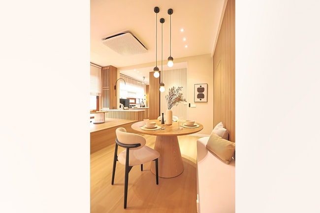
This set-up also creates two distinct dining areas: one with chairs and another with cushions and a low table, as often seen in Japanese homes. This allows Shadee and his family to easily entertain a large crowd or remain connected even when it’s just them and their two kids. “Growing up, there was limited interaction among my family members as most of us would prefer spending time in our own rooms. The only time we came together was during meal times. One of the reasons, I think, was because the house was not very spacious and seemed cluttered,” shared Shadee.
“It was then I realised that the right design and layout in a house was crucial in enhancing my family’s lifestyle. So with this in mind, we created an inviting space that encourages interaction and can accommodate a lot of guests at the same time,” said Shadee, who credits his wife for being the creative force in driving the vision of the house together with Aida.
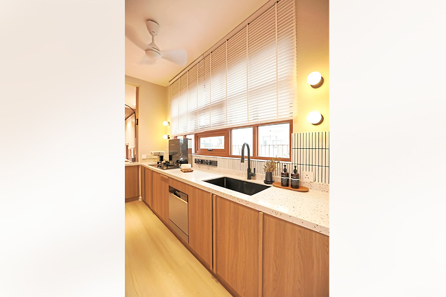
Adjacent to the dining area, there is an island bar that comes with an integrated pop-up socket for phone charging or for plugging kitchen appliances. When not in use, the pop socket can be easily retracted, creating a tidy and organised appearance. This smart use of technology and design can be seen throughout the house including fluted walls to conceal doors, motion sensors and easy control of switches and devices with voice command or phone app.
CREATING A ZEN SPACE
A mix of soft furnishings and clever design solutions adds to the home’s soothing aesthetics. According to Aida, the colour palette of the home was kept mainly gre-ige (a combination of grey and beige) mixed with muted laminated wood colours and warm ambience from the lighting.
“When designing a Modern Zen-Muji style home like this, hidden storage, warm lighting and imitation of natural elements create a cosy and serene atmosphere,” she shared.
Another key architectural element of the home is the wooden deck connected to the Japanese-style dining area via a sliding door. The deck runs parallel to the living room, thus creating a connection to the zen-like garden outside.
“The deck blurs the lines between the inside and outside,” Shadee said.
“Even if you are sitting outside, you can still interact with those sitting inside by simply opening the sliding doors, which effectively transforms into an expanded living area.”
Meanwhile the upper floors are where you can find the children’s and master bedrooms.
From the split level platform and floating-like wardrobe in his daughter’s room to the unique separation between the sleeping space and the entrance in his son’s room, each room has been designed to maximise the use of space.
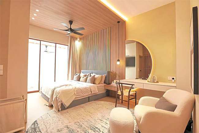
“For the master bedroom, I wanted it to be the most comfortable place for me and my wife. To create a relaxing atmosphere, we used wooden materials, such as wall panels and a built-in wardrobe. Soft round edges and curve elements help soften the overall look of the room,” said Shadee.
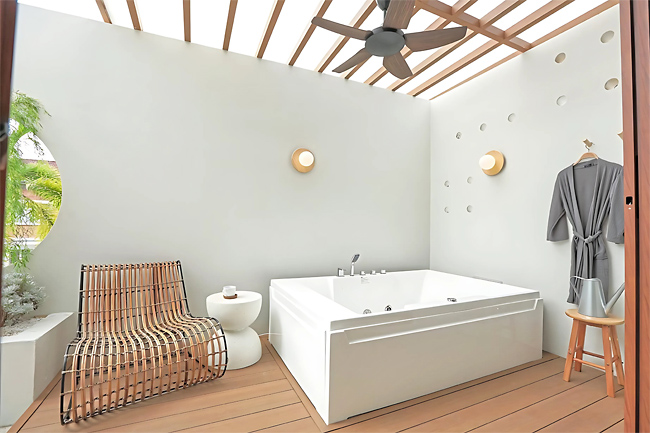
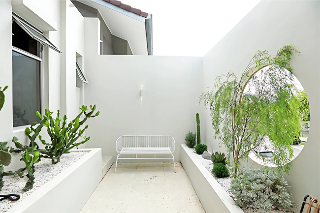
His favourite part of the house can be found at the balcony area of the master bedroom, sweepingly open and cosily enclosed. It’s here that a large jacuzzi sits majestically outside with a cosy lounge area, decked with easy-to-maintain plants like cacti for a natural element.
“It’s here that we spend time together and relax,” said Shadee.


